This project involved creating a website for Salong Sol, a fictional local hair salon in Gothenburg — deliberately built as a single, independently-owned salon rather than a chain, since that framing was central to the brief. Unlike a CMS-based build, this site was hand-coded in HTML, CSS and JavaScript, since the focus here was less on page-building tools and more on the UX process itself: research, structure, and how trust gets built before a visitor even books a time.
I designed the site around two personas: a woman, ~25, newly moved to Gothenburg and searching for a new stylist, and a man, ~35, tired of chains and looking for something that felt more genuine. What they had in common became my way into the brief, neither wanted something that felt anonymous. Researching other salon sites, I noticed a recurring gap: most, especially chains, lack a personal touch, and pricing (particularly for men's treatments) is often hard to find. So the approach became making the site feel privately owned before a visitor ever books.
built this across three connected pages: the homepage leads with a photo of the actual team — you meet Lisa, Elsa, Sofia and Malin before you see a price list, a deliberate departure from "book now" logic, since I wanted relationship to come before transaction. The treatments page mimics a booking flow, with clear pricing and a prominent CTA, to remove the friction I'd identified as a real problem in the industry. The products page is a simple e-commerce section where customers can order the products the salon uses at home.
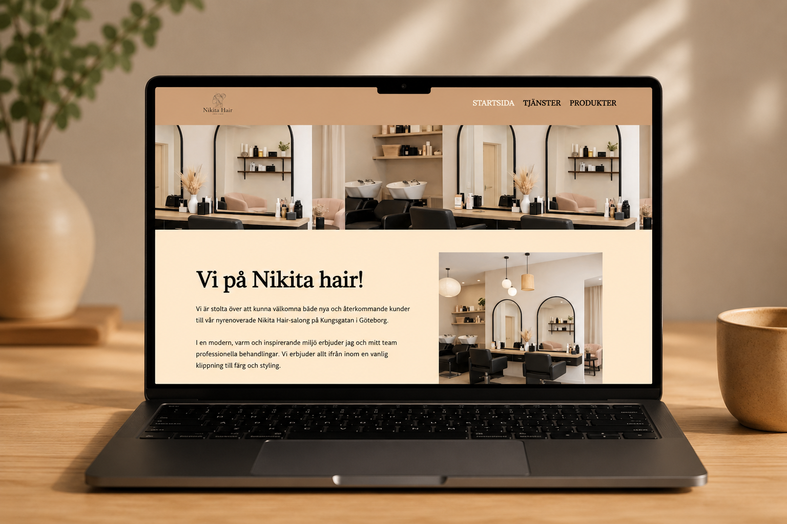
For color, I tested cooler, lighter palettes before landing on warm, soft browns. The cooler options felt impersonal and interchangeable — exactly the "could be any salon" feeling I was trying to move away from. Warm, earthy tones read as cozy and hand-crafted rather than polished or corporate (compare how tech companies and large chains often lean cold blue or stark white to signal efficiency and scale). Keeping the palette soft and undramatic was also intentional — I wanted the content and the team to feel personal, not the interface.
Although the brief was meant to be done solo, I treated it like a real client project: my mentor acted as the client and gave ongoing feedback, and I checked in regularly with classmates and teachers.
That feedback shaped the final result. The logo was hard to read early on — too much happening at once — so I simplified it for clearer identification. The footer's structure felt messy and had to be rebuilt to stay consistent with the rest of the site. On the other hand, people responded well to the warm tones and the clarity of the treatments page, which confirmed the core direction rather than signaling a change.
The biggest resistance actually came from myself. The site has three fairly different "modes" — an informational homepage, a booking-flow-like page, and an e-commerce-inspired product page — and I was worried the transitions would feel disjointed rather than like one coherent experience.
To test that, I ran a simple but effective user test: I had people who didn't know I'd built the site navigate it and book a time with no involvement from me. That gave me honest feedback on where they hesitated and where the flow felt natural, and let me refine navigation, CTA placement, and visual consistency between pages until it felt like one site instead of three.
On the research side, I also looked at how other hair salons had built their sites, and asked family and friends across different age groups what they felt was missing from their own stylists' websites.- HTML & CSS Used to hand-build the site's structure, layout, and responsive design without a CMS or page builder.
- JavaScript Used for interactive elements across the site.
- Canva Used for image production.
- GitHub Pages Used to host and publish the finished website.
- Unmoderated user testing Had people unaware of my involvement navigate the site and complete a booking, to surface honest friction points in the flow.